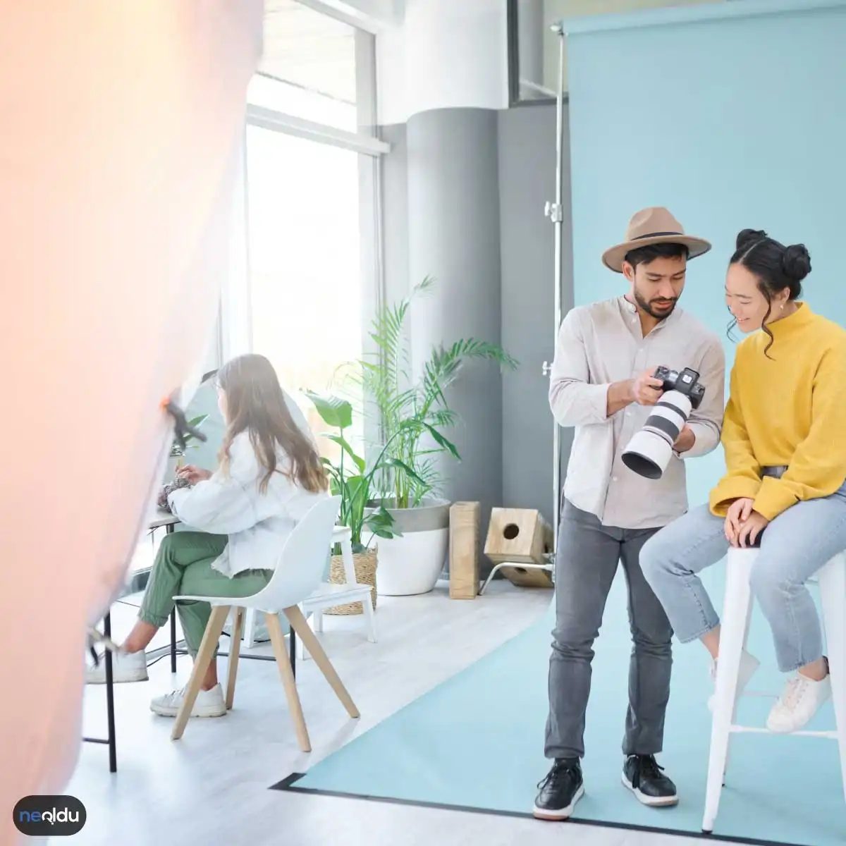
Photography is more than capturing light. It is the art of freezing time and telling a story. But if you think you can press a button and take a decent photo, you’re wrong. In order to take truly stunning photos, you need to consider the interplay of light, perspective, and color. It’s about the emotional impact. Here’s how to go from amateur snaps to intentional shots.
Control the light for better photos
Light is more than just illumination. It is the foundation of your image. When used correctly, it can distinguish between snapshots and photographs. You should check where the light is coming from. Is it harsh? Soft? Directional?
Many beginners ignore shadows. You shouldn’t. Shadows add depth. Without them, your photos will look boring. Think about the hours of the day. The golden hour (time after sunrise to sunset) provides soft, warm light. This is usually when portraits look their best. The midday sun creates strong contrasts that are difficult to control.
1. Use light with purpose
Don’t just wait for the light to find you. Find it.
- Directional Light: Try shooting the subjects from the side. This creates texture and dimension.
- Backlight: This creates a halo effect or silhouette. It adds drama.
- Diffused light: Cloudy days are a natural softbox. Avoid harsh shadows on faces.
“Light shapes the mood. Dark shadows hide details, but soft light reveals them.”
Composition and perspective
Even a well-lit photo can fail if it’s poorly composed. Composition refers to how elements are arranged in a frame. Perspective is the position of your eyes in relation to the subject.
Most people shoot at eye level. It’s boring. Please count it. Let’s get high. lie on the ground Let’s change our perspective. An ordinary street scene suddenly becomes dramatic.
The rule of thirds is a good place to start. Imagine that your frame is divided into a grid of nine squares. Place the subjects along these lines or at their intersections. It creates balance. But rules are eventually broken. Violating them creates tension. Take advantage of this tension.
Color and contrast
Color drives emotion. Red conveys a sense of urgency. Blue feels calm. Green feels natural. By understanding how colors work together, you can control the emotions of the viewer.
Contrast is just as important. The high-contrast images are bold and impressive. Images with lower contrast have a softer, dreamlike feel.
Look for complementary colors. These are the colors that are opposite each other on the color wheel. They pop against each other. The orange subject stands out when the background is blue. Notice the colors that are already in the scene. You may not need to change them. Sometimes it just has to frame them correctly.
Putting It Into Practice
You don’t need expensive equipment to get started. A smartphone is enough. The camera doesn’t make the photographer. The eyes do.
Start by observing. Look at photos you admire. Ask yourself why they work. Is it light? The angle? Color palette? Copying techniques are a great way to learn. Experiment with different settings. See what happens when you change the ISO or shutter speed.
Photography is a skill. This takes practice. Don’t be discouraged by bad shots. Every bad shot teaches you something.
There is no such thing as photography without light. This isn’t just a cliché, it’s a physical reality. Capturing the right light gives you a choice between what the digital sensor sees. A shot taken in the wrong light will not give that “alive” feeling, no matter how well it is edited. The direction, hardness and temperature of the light determine the spirit of the painting.
Natural light is always the leading actor. The Sun is the most powerful and most affordable studio lamp in the universe. But this lamp is sometimes cruel. At noon, when the sun is overhead, the light is harsh. Shadows become sharper, details on faces disappear, contrast tires the eye. For this reason, you should probably avoid direct sunlight when shooting outdoors.
So what is the solution? A cloudy day essentially acts as a softbox. Clouds scatter sunlight throughout the sky. This provides even, soft lighting. This is ideal for portrait shots. Skin tones look natural. The glare in the eyes becomes less, the expression is read more clearly.
If you have to shoot on a sunny day, find shade. The shadow of a building, the light filtered through the leaves of a tree, or even your own shadow save you from the effects of harsh light. Just get into the shade and shoot. The light hits your face indirectly, that is, in a “diffused” way. This makes the skin look smooth and preserves details.
Use artificial light sources with this logic. Flashing directly is often considered an amateur mistake. Instead, reflect the light onto a wall or ceiling. Thus, the light source expands and leaves a soft shadow.
2. Adjust Framing and Composition

3. Create Perspective
Perspective is the magic part that turns that “flat” image into depth and that “ordinary” moment into a story. Most people see this as simply zooming out or zooming in. Mistake. Perspective is managing the angle from which the viewer sees the world.
What you reject is as important as what you choose. When you combine foreground, midground and background, your photo becomes an experience rather than just a recording.
Techniques That Create a Sense of Depth
One straight line kills. People quickly stop looking at flat images. To add depth, try the three-layer approach:
- Foreground: Place something at the bottom of the frame, or even at the edge. This “draws” the audience into the scene.
- Medium Shot: Your subject is here. This should be your focus.
- Background: Provides context. Mountains, buildings or a blurry sky.
Without this distinction, the painting looks like a plain wall. When you add layers, your eye begins to wander through the image.
Angle Games
The view from above (bird’s eye view) can be powerful and controlling. The view from below (frog’s view) can make a subject seem majestic, even scary. Choosing a different height than normal eye level conveys the same scene with a completely different feeling.
Step away from trial and error. Get on your knees. Climb the ladder. Lie down on the floor. When you move out of the standard position, that seemingly “normal” landscape takes on a new perspective.
Case Analysis: Roads and Lines
How do parallel lines behave with perspective? They approach. This natural line perspective adds a sense of movement to photos. A long road, river or railway line draws the viewer deeper into the scene, starting from the bottom of the frame and moving towards a center called the vanishing point.
Use these lines as a guide. Stretch them from one corner of the frame to the other. This directs the visual flow and emphasizes the subject.
Common Mistakes
- Straight landscapes: If the horizon line is slanted, it’s distracting. To fix this, adjust the camera level or correct the curve in post-production.
- Distracting backgrounds: The tree branch behind the subject should not look like it is coming out of his head.
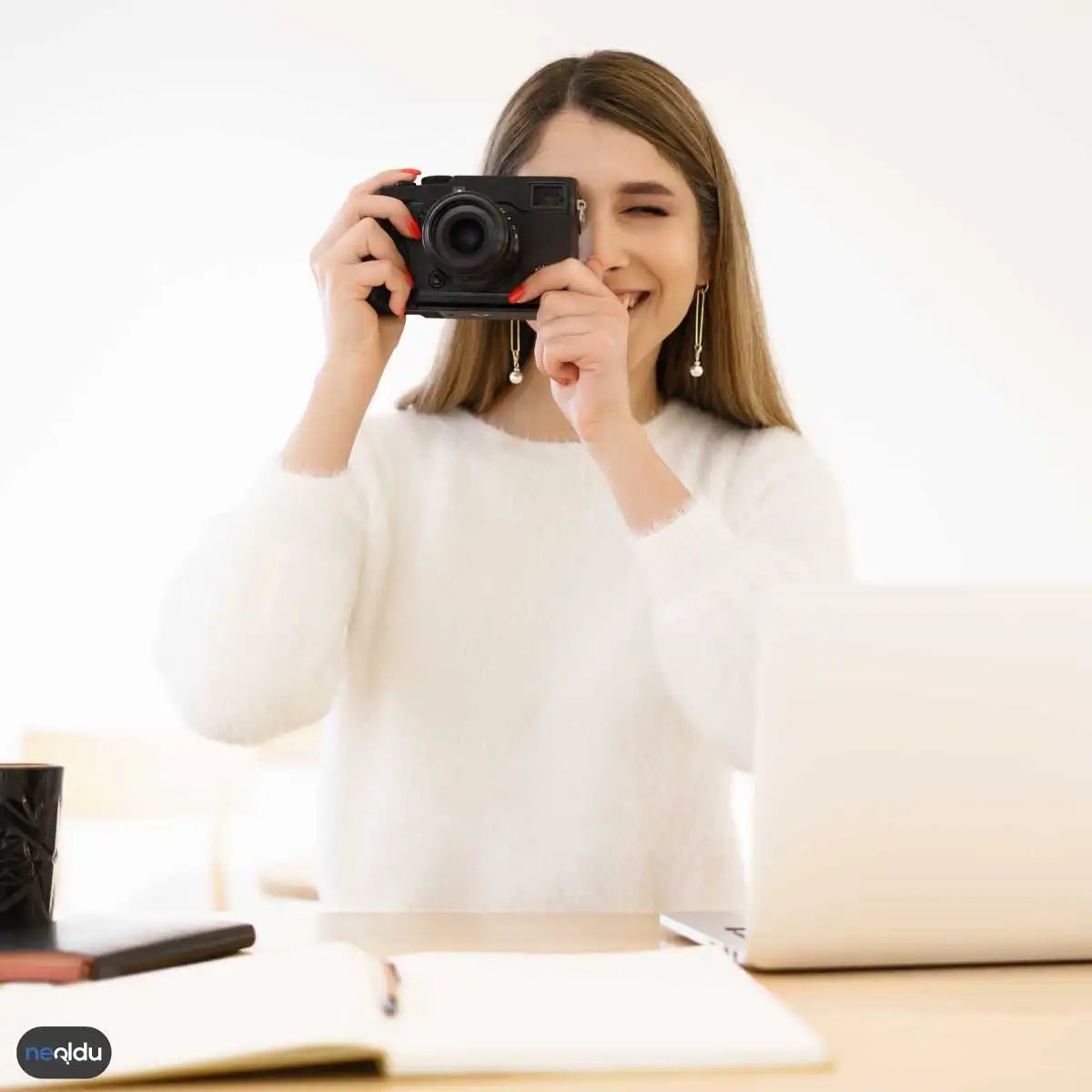
Color is not just an aesthetic choice, it is a technique that determines the spirit of the image. Even wrong balance can flatten the picture. The right balance is the most powerful tool to add depth. Here are practical ways to control color and contrast:
Take Control of the Color Palette
Color harmony in photography confines the viewer to the scene without disturbing his or her eyes. There are three basic approaches to achieve this:
- Analog Colors: Hues that come next to each other on the color wheel. For example, green grassy field with blue sky.
- Contrasting Colors: Colors on opposite sides of the wheel. Like red and green.
- Monochromatic Shades: Different shades of the same color. From the dark blue to the light blue in the sky.
These three methods simplify composition. Thus, the viewer gets away from the chaos. The focal point becomes clear.
The Effect of Colors on Depth Perception
Colors can manipulate the perception of distance. Warm colors (red, orange, yellow) come towards our front. Cold colors (blue, green) shift towards the background. You can add depth to the scene using this optical illusion.
For example, a warm-toned object in the foreground will stand out more compared to a cool-toned landscape in the background. This is a powerful method that draws the viewer into the photo.
Adjust Color Saturation Level
Highly satisfying colors attract attention. Low saturation colors give a more natural and calm atmosphere. When editing your photo, check the saturation level before touching the colors.
Overly saturated colors can make the picture look artificial. This error can cause a big problem, especially with skin tones. For a natural look, reducing saturation is sometimes enough.
Contrast and Light Balance
Contrast is the difference in tone between the black and white of an image. High contrast images create dramatic impact. Low-contrast images give a softer and nostalgic atmosphere.
Light directly affects contrast. Soft light (cloudy days) reduces contrast. Hard light (sunny noon) increases contrast. Using these two situations, you can create the emotion you want.
Practical Application Suggestions
- Foreground and background separation: Warm colors in the foreground, cold colors in the background
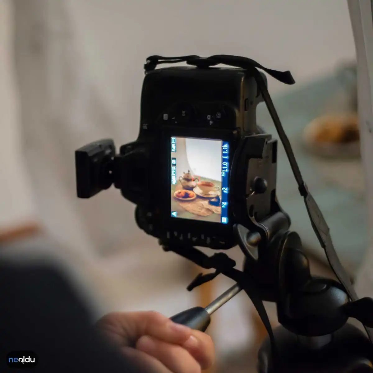
Color and contrast: Harnessing the emotions of photography
Color and contrast are important elements in creating the emotional impact of a photograph. It’s not just decoration. they define.
Color determines tone. It’s the atmosphere that lives in the frame. Contrast? That’s the tension. Controls the visual separation of light and dark, warm and cool. When you do this, your image is no longer flat reality. They become experiences.
Get to know the Color Wheel
Let’s start with the basics. You need to understand the color wheel. This is more than just a diagram. This is a relationship chart.
Main colors – red, blue, green. Secondary colors – orange, purple, yellow. These are not isolated. they interact
“Warm colors create energy. Cold colors create peace.”
Red, orange and yellow move forward. They feel energized. Live. Sometimes it’s uncomfortable. That’s the point. Blue, purple and green fade. They provide distance. peace
Mix it up on purpose. The sunset shot is skewed to the warmer side to convey a sense of urgency. Foggy mornings usually feel cooler and quieter. It’s not just about choosing colors. You choose your mood.
Play with color contrast
The contrast is striking. This is why the eye jumps to certain places.
Opposite colors on the color wheel reinforce each other. Imagine bright yellow flowers on a dark blue background. The yellow pops. The blue deepens. The interaction is in the best possible way.
However, you can also play with similarity. Grouping objects with similar shades creates a softer and more subtle contrast. It’s quieter. Less aggressive. Sometimes that’s what a story needs.
Balance is the key. Too much contrast can be confusing. Too little and it feels boring.
Post-production adjustments
Cameras rarely have perfect balance. Not always.
This is where editing software comes into play. The color grading and tone adjustment tools are fine adjustment tools.
Adjust the color tone. Shift the saturation. Control the intensity.
Do you want a reds to scream? Bump the saturation. Want to hear whispers of the blues? Lower the exposure of this channel. It’s about control.
Post-production is not fixing mistakes. It’s about refining the intention. You turn your original emotional thoughts into visual data.
5. Proper editing and post-processing
This is not a separate step. This is the pinnacle of your choices.
When you edit, you make the final decisions about what’s important. What to emphasize? What is buried?
Use the tools to reinforce the color relationships created in your set. Don’t create new conflicts unless you intend to. Keep the narrative tight.
The goal is consistency. You want every frame to feel like the same conversation.

Post-production reality check
Editing is more than just polishing. It’s where the story actually gets told. The original file is there. Then you have to force them into submission. This is post production. This is the stage where you adjust the exposure, dark the shadows and blow out highlights to match the mood in your head. It’s powerful. It’s necessary. However, it requires the right tools and a clear vision.
Choose the right engine
You want software that doesn’t work against you. There’s a reason why Adobe Photoshop and Lightroom are heavyweights. Easily handle color grading, sharpening, contrast curves and perspective correction. Of course, there are cheaper options. But if you need precision at scale, these industry standards exist for a reason. They don’t just “touch” the photos; They transform them.
Mastering Exposure Balance
Exposure controls the brightness. Simple. However, if done incorrectly, details can be lost. An underexposed image turns into a dim black hole. The overexposed photo becomes a white sheet of paper. Correct exposure reveals texture. color life During editing, you need to adjust the balance between lights and shadows. We want to restore the details of the shadows and keep the highlights intact. It is a battle between light and darkness. Win this war and your image pops.
The power of color grading
Color determines the emotional tone. Warm colors make you feel nostalgic. Cool colors give a calm or melancholic impression. Color adjustment allows you to adjust saturation, white balance and hue. Want a cinematic look? Push the shadows toward blue. Want a retro vibe? Desaturate the greens and boost the oranges. It’s not just about making things “look real”. It’s about making the audience “feel” something.
Sharpening and detail enhancement
Details matter. Especially in portraits, the texture of the skin should look natural and not plastic. Or for landscapes where you want to make each leaf clear. Editing software allows you to increase sharpening or improve microcontrast. But be careful. Over-sharpening, artifacts may appear. It has a digital and rough feel. Use with caution. Enhance, don’t distort.
Trimming and composition
Sometimes the shots are quite good. The composition is off. Or maybe you want an aspect ratio suitable for social media. Crop allows you to remove distractions. It isolates the target. It changes the narrative by directing your audience’s eyes exactly where you want them to be. Force a 16:9 cinematic look or square it up for Instagram. The rule of thirds becomes a guideline, not a law. You can break it whenever you want.
Nature and landscape photography tips
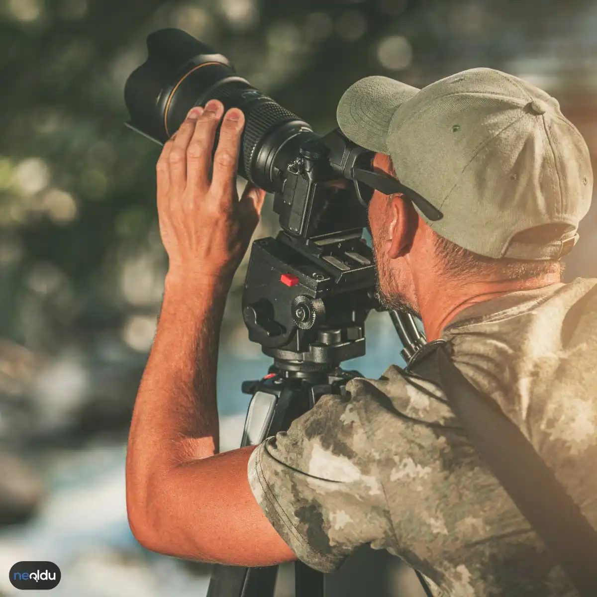
A wide-angle lens is recommended for nature photography. Unobstructed view. But what about portrait photography? This is where the story gets personal. It’s not just about photographing faces. It’s about capturing the person behind it.
Light weight
Light is still king here, but the rules of the game have changed. It’s no longer just about chasing golden moments of drama. You’re looking for softness. direction
Is the midday sun bright? This is a challenge. Draw a dark shadow around the eyes and under the nose. If you don’t want a high-contrast, edgy look, you want diffused light. Open shading works wonders. The cloudy sky acts like a giant softbox.
But there’s a reason why photographers talk about window light. Directional but soft. Simulate faces. It gives dimension. Placing your subject near a large window creates a natural transformer that would cost thousands of dollars to recreate with studio lighting.
Equipment: Lenses are very important
You don’t need a $5,000 camera to take great portraits. You need the right glass.
Wide-angle lens? Avoid headshots. They distort features. The nose looks too big. The face looks elongated. If you don’t do something abstract, this is a recipe for disaster.
Prime lenses are your best friend. There’s a reason why the 50mm and 85mm are standard lenses.
- 50 mm : Multifunctional. Close to what the human eye can see. Perfect for environmental portraits where a background is needed.
- 85 mm : The portrait workhorse. Flatters facial features. Compresses the background nicely.
“A fast aperture allows you to separate the subject from the background.”
f/1.8 or f/1.4 aperture? Produces a cream-colored background blur (bokeh). It draws the eye straight to the eyes. There are no distractions. Exactly the theme.
Composition and Connection
The rule of thirds still applies. Place your eyes in the top third of the frame. Look down there. It feels natural.
But don’t get caught up in the grid lines. Real composition is created through interaction.
Are they looking at the camera? Or away?
Look at the camera to connect. It invites the viewer in. When you look away, a story emerges. Who are they thinking of? What did they see? It makes you feel like a moment has been stolen from you.
Background and Context
In landscape photography, the background is the “target”. Support for portraits.
A messy background can ruin your photos. It competes with the face. If you can’t change the position, change the angle. Change the subject and ask them to turn their backs to the busy street. Or zoom in. A shallow depth of field blurs the chaos into abstract shapes and colors.
Let’s think about the environment. If you’re shooting musicians, make the instruments part of the frame. If they are artists, show them in your studio. Even if you say nothing, the meanings overlap depending on the context.
Freezing vs. Blurring
Movement also tells a story. You don’t always need a static, clear image.
A slightly blurred face and sharp eyes can convey movement and emotion. It feels very raw. Genuine.
But if you’re shooting in low light, you
Build trust before you pull the trigger
Portrait photography is more than photographing faces. It’s about freezing the personality. We want to emphasize the natural beauty and personality of the subject with the help of the sensor. But before the camera turns to look, the work begins with a conversation.
If the model feels like a sample, the photo looks clinical. They need to feel human. Create a relaxing environment. Chat. joke Make them laugh. When the tension subsides, the expression changes. This way you can capture the real moment. Smile openly. Keep your shoulders relaxed. This connection is the basis for an impressive portrait.
Control the light
Light is paint. Your camera is just a brush. Soft natural light is usually the safest way to take beautiful portraits. Rough shadows divide the face eerily.
Look for the “best time” in the early morning or late afternoon. The sun is low in the sky. Light diffuses more atmosphere. Gently hug your face. If you’re shooting during the day, look for shade. Avoid direct sunlight. Use the shelter of trees or overhangs of buildings to absorb the impact.
Professional photographers don’t just wait for good weather. They manipulated it. Use the reflector to reflect light into the shadow area. Position the subject so that the light hits it from the side or slightly above. Steering direction. Control the quality.
Design background
Your background sets the tone. A messy background attracts attention. It makes you look away. It weakens the power.
Keep it simple. Clean the walls. A field of grass. Unclear forest edge. The goal is to make your subject pop. Depth of field makes this distinction possible. Please open the gap. Use a wide aperture such as f/1.8 or f/2.8. Blurs the background (bokeh) and keeps the subject sharp.
“A simple background allows the viewer to see the characters instead of the clutter behind them.”
Locking onto the Eyes
Human eyes are magnetic. Scan their face first. If the eyes are soft or out of focus, the picture will fail. No matter how much you try to improve your lighting and posture, you can’t prevent blurred vision.
Use single-point autofocus. Place the dot directly above the nearest eye. If your camera supports eye-tracking autofocus, enable it. Let technology do the heavy lifting. Check the focus carefully before shooting. Are the irises crisp? Can you see the catchlight? If yes, you are ready to shoot.
Composition and framing
The chaos seems random. This order appears to have been made on purpose. Use compositional rules to guide your audience’s gaze. The rule of thirds is a classic starting point. Imagine you have a tic-tac-toe grid in the frame. Place the subject’s eyes on the upper horizontal line. Place them at an intersection.
This creates a balance. Leaves a “negative space” in the target’s direction of vision and movement. Prevents the image from feeling cramped. Let’s experiment with angles. To convey the power on the image slightly below. Shot from above to convey vulnerability. The story differs depending on your point of view.
Equipment and settings: Technology
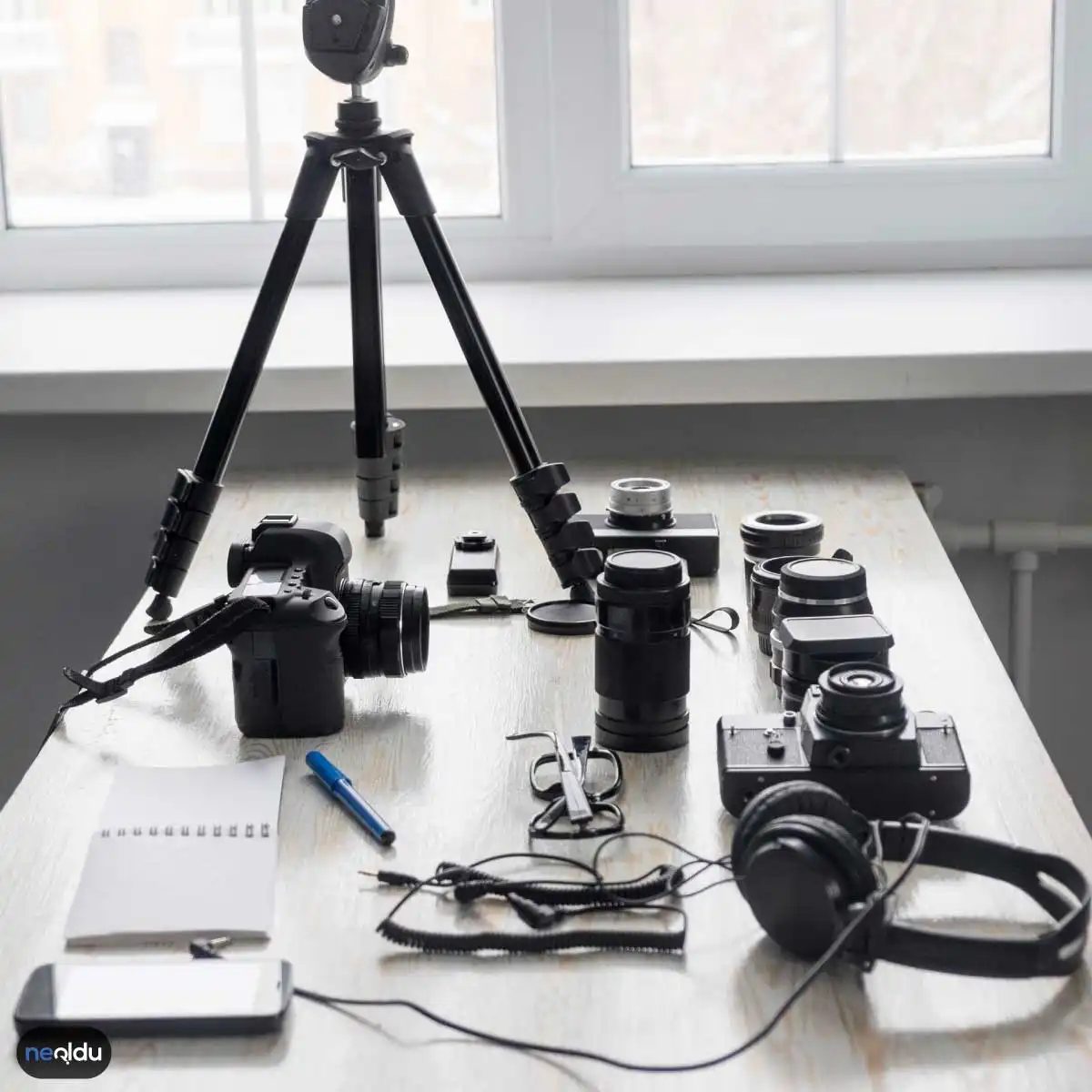
You don’t need the most expensive camera to tell your story. But you have to understand what you are holding on to.
Choose a suitable camera
If you’re just starting out, an entry-level DSLR or mirrorless camera will do. These bodies handle autofocus well and have intuitive menus. You can grow without feeling any limitations. As your work progresses, you can also upgrade to a full-frame sensor for improved low-light performance and dynamic range. Consider your budget. Consider portability. Heavy professional gear is great for studio work, but can be a burden when traveling.
Improved lighting (more than natural)
Natural light is most important, but additional light may be necessary. If you must use the flash, do not point it directly at the subject. Produces a strong, even light. Use a diffuser. Bounce flash off the ceiling or white wall. Diffuse light. The goal is softness. Soft shadows.
Editing Software
In post-processing you will find the final tone of the image. Adobe Lightroom is the industry standard for batch processing and color grading. Photoshop offers more retouching controls. If you’re on a tight budget, GIMP is a powerful free alternative. Online tools like Pixlr make it easy to fix it anytime, anywhere. Choose a tool and learn it thoroughly. Better to be knowledgeable than 10 mediocre tools.
Shooting mode
If you want to learn, avoid automatic mode. Auto makes all the decisions. You want to make the decisions.
– Aperture selection (A/Av): You can adjust the depth of field. The camera sets the shutter speed. Perfect for portraits.
– Manual (M): You are in control. Ideal for even lighting situations and flash work.
– Shutter Priority (S/Tv): You can control motion blur. Use for action and slow motion powers.
Find your style. Test the modes. See what allows you to express your vision more freely.
Final thoughts
A portrait is a combination of psychology and physics. It manages human comfort while manipulating photons to hit the sensor in a specific pattern. Yes, it’s technical. But the best portraits always feel effortless. It feels like a snapshot of real people.
Keep practicing. Talk to your subjects. Watch out for the light. Focus on the eyes. The rest will follow.